Below you will find an archive of iconic work designed for previous agencies I worked for in London & Sydney.

2003 - Monsters Inc Cereal - Boo
Cereal Partners had an opportunity to use the rights of an up and coming Pixar movie. So, they decided to not only do the normal boring promotional packs, but to create an exciting brand new monster cereal.

I decided to think outside the box, and that's exactly what happened. The monsters looked amazing up close and personal, and those eyes wouldn't stop looking at me. So, I decided to use the entire box as the head of the monster, with the additional breakthrough idea of cutting the eyes out, i’d created a trick of the eye! Once the box was made up, the eyes wouldn't stop following me around the room. It was sure to be a success.

In the end this was the only concept presented to the client, they couldn't keep their eyes off it, and neither could the kids in the supermarket aisle! It was one of the biggest grossing cereals during the period it was on shelf, and still to this day Nestlé use it as an example of one of the greatest kids cereal packs ever! Now that's something to scream about.
Design created whilst working for Ocean Branding - London
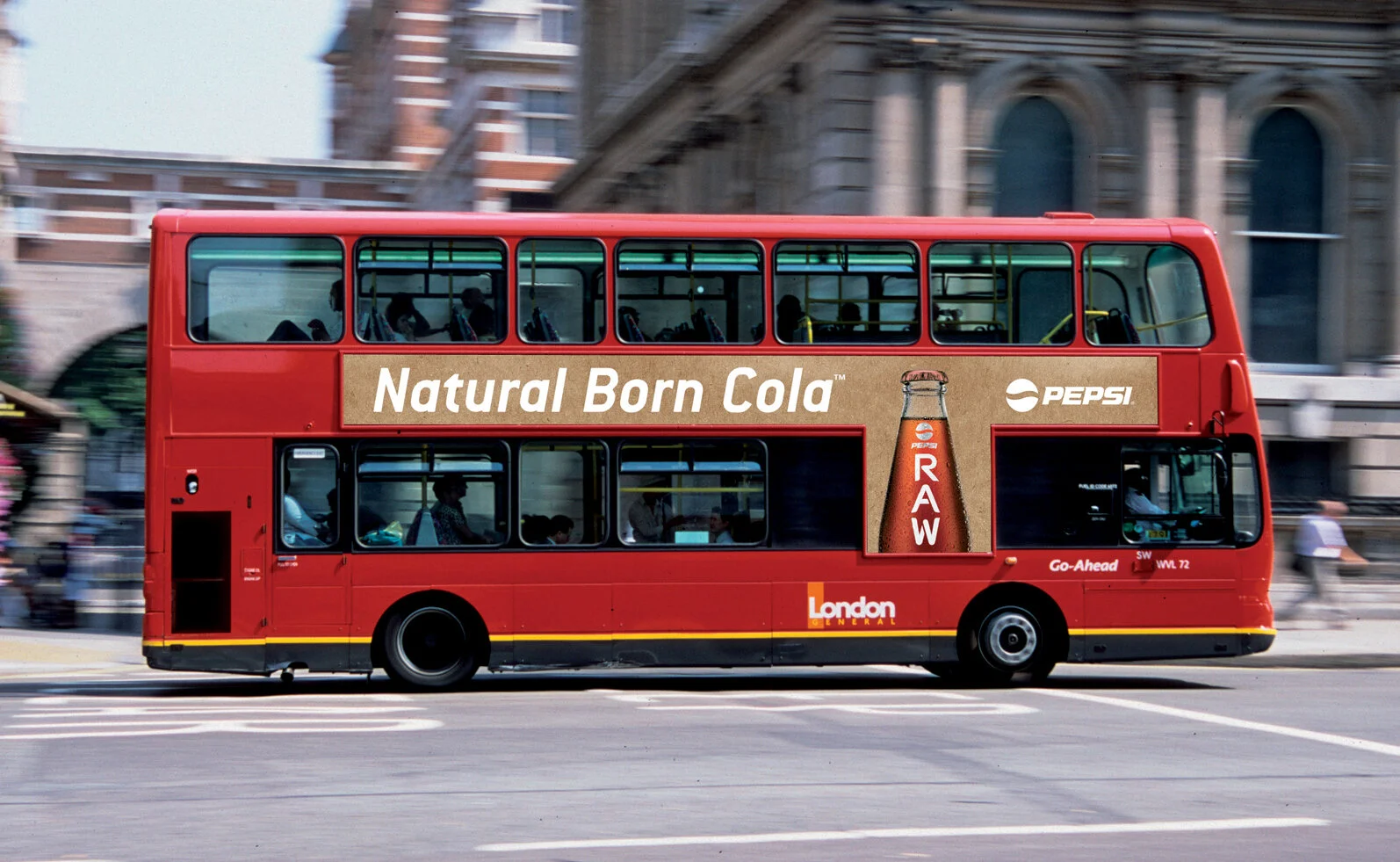
2008 - Pepsi Raw - Less is Raw
Pepsi decide to create a back to basics cola based on 4 naturally sourced ingredients. Natural plant extracts, Cane sugar, Apple extract and Gum arabic. A stripped back cola for the premium adult market, brilliant!

The name was already set and the bottle was already existing. So how do you make a cola look stripped back and natural?

Answer: Less is more…

The idea of a simply stencilled logo straight onto the bottle surface gave it the desired effect. All the touch points from multipacks to bus ads were kept to a very simplistic level, using only a few colours with the use of raw materials.

It ended up being the biggest launch Pepsi had done in 15 years! I'll have a Rum and Raw please... Result!
Design created whilst working for ZigguratBrands - London

2008 BBDO Adverts - In the Raw
2008 - Wall’s Sausages - Everyday Expert
Putting the love and trust back into a nostalgically iconic British brand whilst working for Ziggurat in London. Drawing on the brand’s heritage, original store in ‘Jermyn Street’ and archive packaging, I developed the iconic Wall’s crest to convey over 200 years of sausage making expertise. Design elements were deconstructed and the key brand equity of the Wall’s red script typeface was retained. ‘The Finest Cuts’ strapline underpins the brand, making reference to the Wall’s promise of quality and value
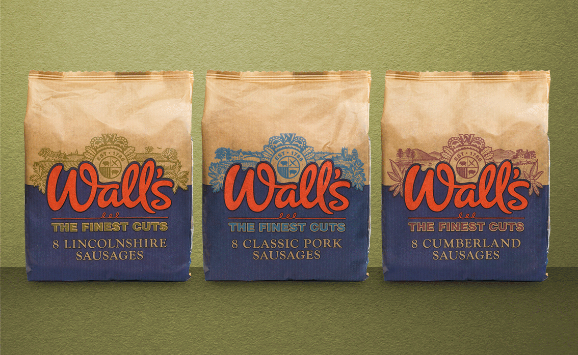
Behind the descriptions; ‘Classic, ‘Lincolnshire’ and ‘Cumberland’ different woodcut landscapes allude to an idealised English countryside. I also reflected the skills and traditions of the family butcher by introducing a brown paper wrap

Andrew Davidson engraved all the illustrated assets and printed them from a block of old English Lemon wood. The hard wood used in block making is slow growing, so engraving blocks tend to be made quite small, the largest being about A5. The block is then rolled up in ink, and printed using my 1857 Albion hand press onto Japanese hand made or mould made papers.

Meet the ‘Piggio Van’ that whizzed around town promoting the new identity whilst sampling sausages with it’s built in BBQ device.

From plastic fantastic to a well crafted classic. Worthy of the Wall’s promise of quality and value for over 200 years!

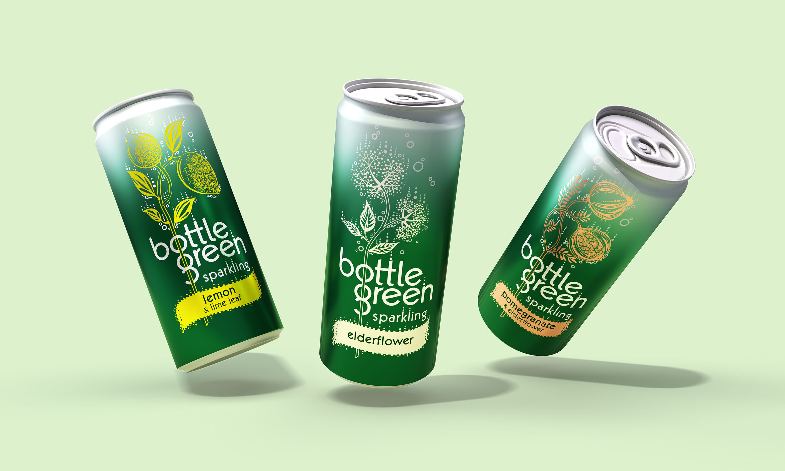
2009 - Bottlegreen - Leaves an impression
Bottlegreen was born in the Cotswolds and redesigned back when I working at Ziggurat in London. We were tasked to give the bottlegreen brand strong presence alongside a design that brought to life the values and personality of the brand, product and company.


In the true spirit of pioneers, bottlegreen was more of a happy accident than a carefully thought out plan. Using their background in winemaking, the couple decided to turn their hand to creating elderflower cordial using a unique cold-filtration process. It turned out to be so delicious, that the rest is history.
The product leaves an impression on the palette and we wanted the design to build on this compelling quality.
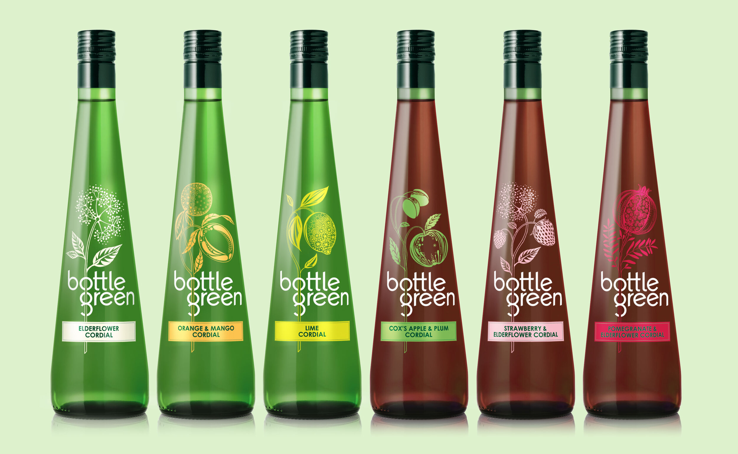
There was an enduring sense of discernment and care that went into the flavour development and portfolio management. We felt that it would be meaningful to reflect this through the design. Both of these truths would create a clear and defendable position for bottlegreen in the adult soft drink category.
The ingredient illustrations thread through the ‘o’ and the ‘g’ of the bottlegreen brand marque linking the delicate flavours with the boldness of the brand. The bottlegreen marque is split to make it more immediate and legible so that it creates a memorable shape rather than just a name. The cordials also appropriate an emporium of chalky bright colours to denote flavour and taste. Cans were designed with a sense of joyful effervesce, tantalising the most discerning palettes.

The hand drawn illustrations of natural flavour were developed and given a unique textural style, from an up and coming textile designer in London.

The illustrations are a contemporary take on the old craft of pressing flowers alluding to the essence of the brand ‘leaves an impression’. The originally released double paged magazine advert illustrates this idea simply and elegantly.

As part of its ongoing support for the Breakthrough Breast Cancer charity, bottlegreen had developed a special limited edition bottle collection, specifically for the fashion charity campaign, Fashion Targets Breast Cancer (FTBC). The Designs were inspired by the works of Monsieur Qui, a Paris street artist that uses powerful feminine poses within his work.
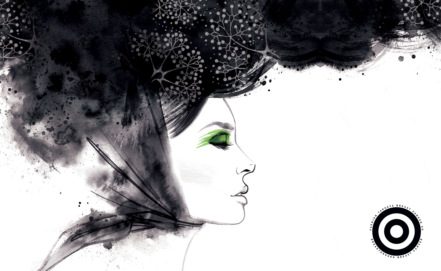
Each pose contains stylish bursts of ingredients within. Utilising gloss varnish effects to elevate the premium cues at point of purchase.

With three unique bottle designs to choose from, bottlegreen’s classic sparkling pressé flavours include, elderflower, pomegranate & elderflower and ginger & lemongrass.
The brand has since gone on to become a leader in premium cordial drinks around the globe. Continuing to support charities with purpose! Turning Bottlegreen into a true market leader, now worth a staggering £12m, with sustained YOY 8% growth. Onwards and upwards! Cheers to that!

2011 - YO! Sushi - 20 minutes in TokYO!
Designed while still working for Ziggurat London. Influenced by the bright poppy signage from the streets of Tokyo, with a minimal quirky twist. Using type style elements from the guideline supplied, language became a leading driver for all the signage and packaging used, the colours came from the vibrant plates used on the conveyer belt within store. A truely fun Tokyo dining experience for all the senses to enjoy!


2016 - Weight Watchers - Live your Life-style
Tasty food your way! A three-tier colour system was created to distinguish products from retail / supermarket (everyday), non food (technology) & WW membership (exclusive). Developed whilst using the new WW logo and clever new SmartPoints system. Making them the tastiest looking packs on the block, no need to run and hide these from people anymore. So, enjoy getting active and start feeling confident again! New look, new you, new year… This was one of my final creative ‘big pitch’ wins for Cowan design Sydney, before I decided to spread my wings and go freelance.


Below you can see the before vs after, making a big difference in tone. No longer a tired cheap looking diet brand, and more of an active foodie life-style choice.

2009 - Red Sky - From nature’s kitchen
Red Sky was one of Pepsico’s biggest launches of 2009. They wanted to create a new brand that was made with 100% natural ingredients, supporting the Rainforest Alliance and also the farmers who produced the potatoes. The packs were produced using paper stock to give them a tactile and earthy look and feel. The Name came from the phrase ‘Red sky at night Shepards delight’ which means fair weather is generally headed towards you, so this is ‘a perfect day ahead’ for the land and farmers involved!

Below is the final TV advert that was created straight from the look and feel of the packaging above. It’s great to see an idea spring board from the extra level of detail you put into the packaging.

2004 - Terry’s Chocolate Orange - An iconic segment in time
This work was done back when I was designing for Smith & Milton in London (which is no longer around). I always believed that this was its most iconic year it existed in, from seeing update after update taking more and more character away from what should be a truly nostalgic brand. The ‘O’ orange peel device still stands the test of time whilst nodding back to its roots.


Looking back at some of the ideas for Easter! They really started to give the brand some solid equities to use, from using the leaves to express rabbit faces or even devil horns with a naughty or nice angle.

Terry’s Chocolate Orange has been around since 1931, and through the years it’s slowly evolved. You can almost guess the decade they were designed in. Which is your favourite?

Does anyone remember when Dawn French did the adverts? They don’t make ad’s like them anymore, that’s for sure!
Still more to share… come back soon!