


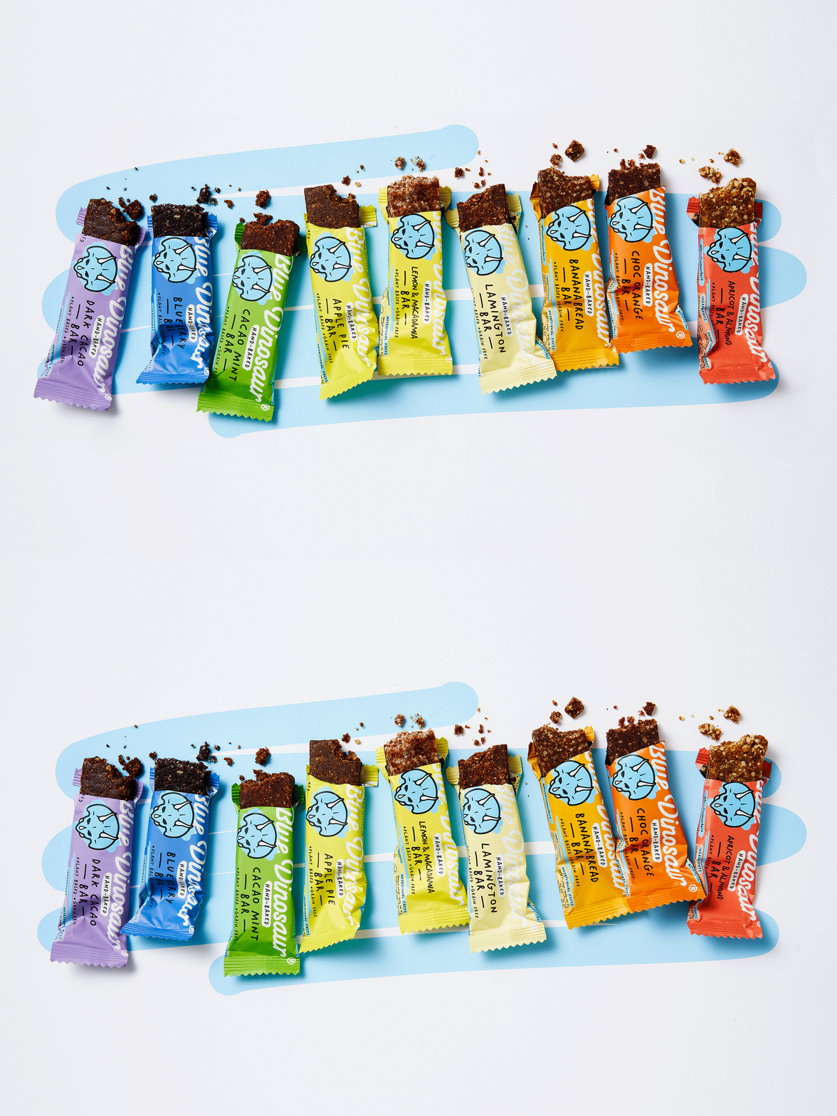






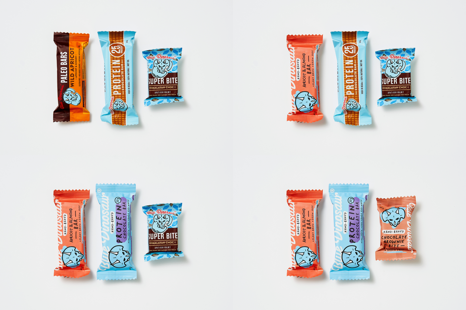
FROST* COLLECTIVE approached me to help give Blue Dinosaur a hand-baked makeover. Working closely with their in-house team we managed to get to the perfect sweet spot.
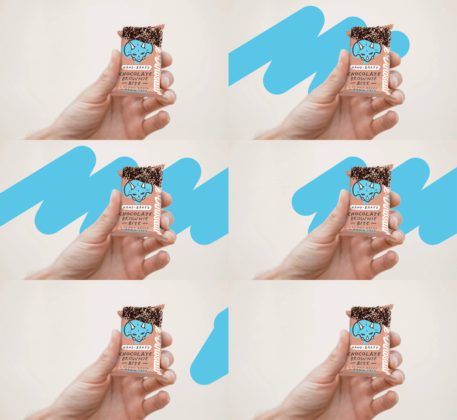
The logo and typography were redrawn to look like they were all drawn by the same hand. Modern loose coloured elements also added to the hand-done nature.
A selection of contemporary colours was used to generate taste and also create standout for the iconic blue Dino.
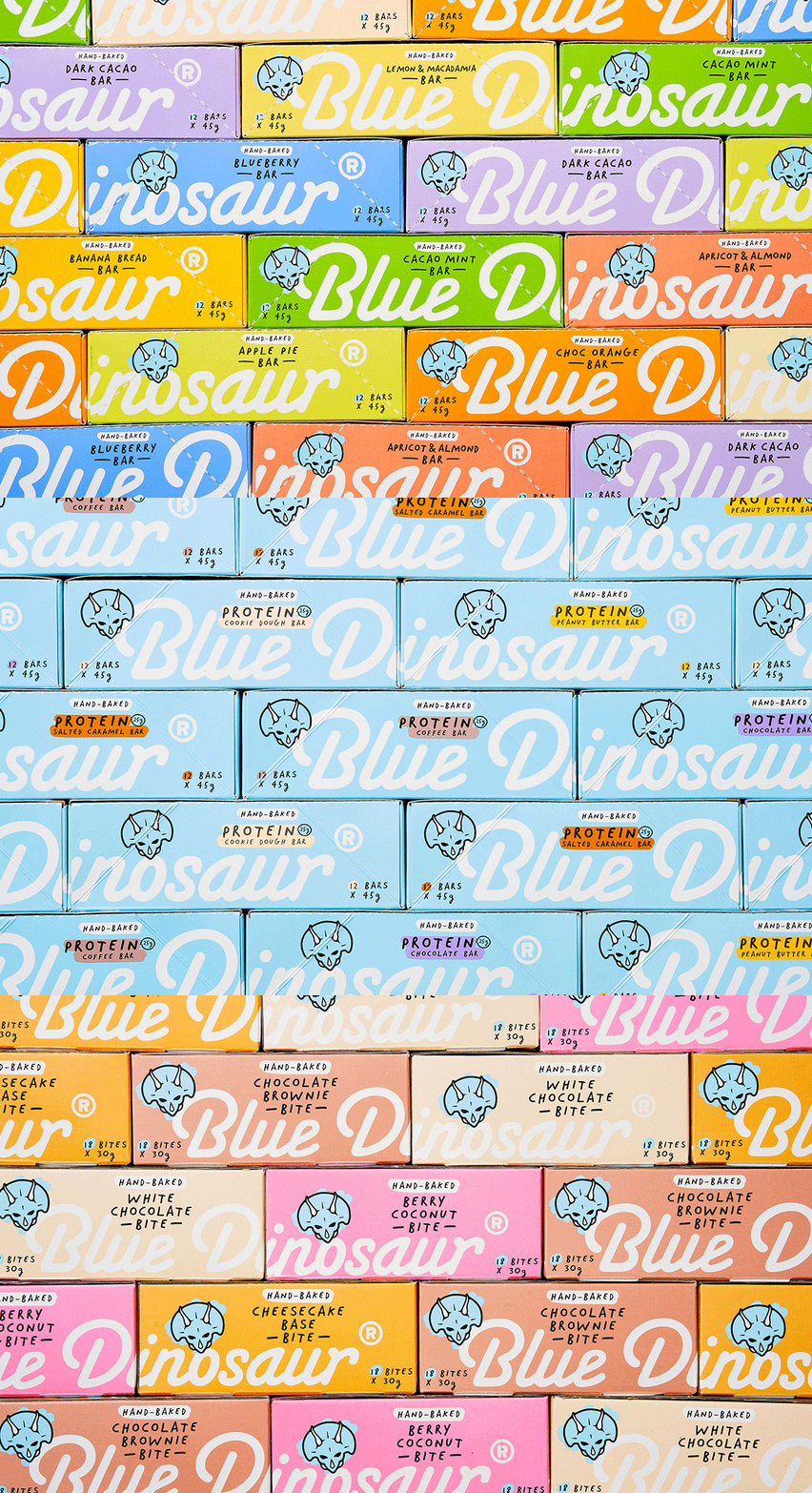
Outer boxes that house the bars were designed to create standout and stackability within stores.
The new rounded hand-drawn style now has the ability to come alive through digital brand expressions. Literally drawing you into the world of Blue Dinosaur.
Using this new style gives the brand freedom to express what it feels like to eat these nutritious snacks. Release your inner dinosaur!
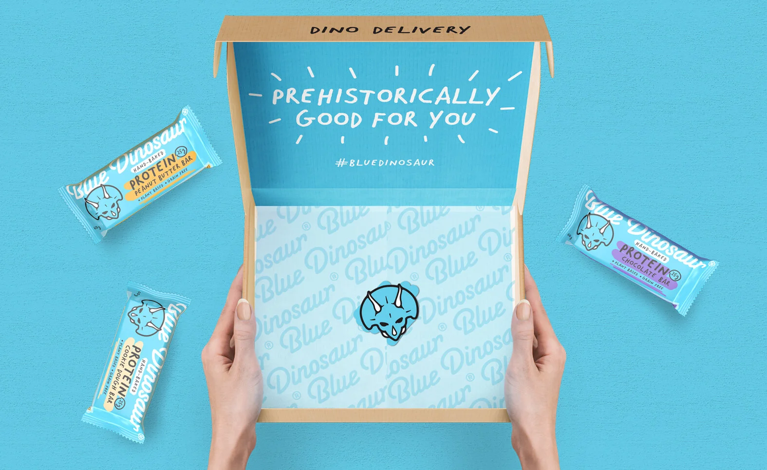
Prehistorically good online mixed boxes send positivity through the use of witty language from within.
The protein bars now own the Blue Dinosaur blue and use hand-drawn highlights of colour to indicate taste.
The brand has moved away from its original strong bodybuilder look to a more approachable, real, everyday snack that fits into your lifestyle.